
So lately it seems that I have been coming up with designs on Friday nights for friends I work with at CNET. This proves to be a good opportunity to be really loose with my design ideas, try new color pallets as well as to give me more sandbox projects to code with CSS and semantic markup. I enjoy being prolific as it helps make me faster both with my visual designs as well as with my recent renaissance with code. Tonight, my project was to come up with a brand for MobKool – a blog from friend John Potter.
I’m not exactly sure where the name MobKool comes from – other then the fact that John used to smoke KOOL cigarettes. A nasty habit he gave up years ago, but apparently still maintains a fondness for the name! At any rate, I did not have much to go on other then some ideas tossed around of a crumpled box of KOOL smokes. At first, it seemed like a good idea – but with logos, it is important to rely on minimalistic shapes to convey an idea. So to keep it simple – I played off the KOOL brand with the tight kerning of the double OO’s under a spotlight – highlighting a broken habit with a smashed butt. Also, since KOOL’s are menthol, I shot for a complimentary color scheme with a sort of minty backdrop but a warmer golden foreground.
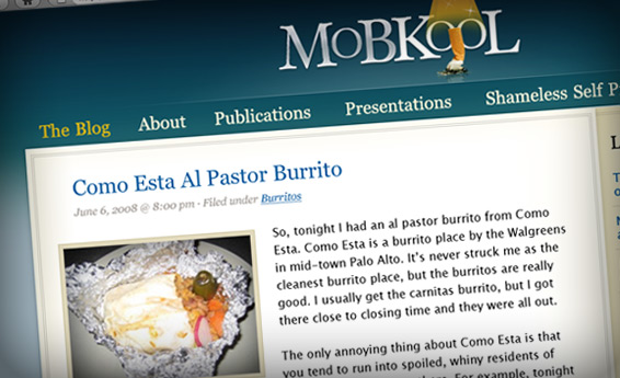
As I said – MobKool is Johns blog – so the contextual elements rely on simplicity to allow his rants to display with large left aligned headlines as the most prominent part of the page below the brand and navigation. Since John is an engineer – SEO is important (Its actually important for everyone… but he always gives me a hard time about design not thinking about SEO – A designer stole his milk money when he was a kid) thus while the site is quite visual – all navigation and content is linkable text rather then to use images for anything other then background shell components and the logos found in the header and footer. Lastly – Mr Potter is pretty “web active” – so links to the various social places he can found online sits as a signature element in the footer.
This was a pretty quick design, and I am hoping to code it over the weekend by treating it as a sort of CSS Zen garden project by using the mark up of this site, skinned with with his presentation layer. Who knows… maybe he’ll even give me a link back to my site!
 I am an avid student and evangelist of user-centered design principles - I have created or overhauled some of the world's largest online Business & Technology properties. My focus has always been on building functional design systems that creatively solve business problems. Solutions that convey brand & messaging, but more importantly, are intuitive to maximize the possibilities of an interactive medium.