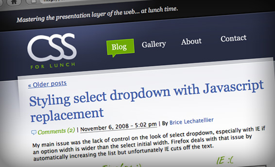
This week Andrew Mager showed me “CSS For Lunch” – a new site that he had come up with. The goal is to get a group of talented tech producers to author various posts with the tips and tricks that they use on a daily basis. These can be quick rants that offer up an interesting method, yet can be both written or read on ones lunch break.
A number of folks at BNET, Revision3 and Apple have expressed interest in sharing their thoughts and insights. While I have little to contribute on the technical side, I felt compelled to offer up a design for the site, as it is one way that I may contribute to an idea that would seem to be a resource for many. (myself included).
The site is currently a simple blog, though will potentially include a gallery of sharp work and displays of the clever code in action. That said, it is primarily a utility, so needs to be contextual and to the point. Therefore I did not want to create a presentation layer that is overly elaborate, or stylized – but to devise a clean look that allows users to get immediate access to the posts. I use a strong contrasting color palette that while grounding the top and bottom of the page, are intended to draw the eye to the nuts and bolts of the content itself.

I had not used the specific color scheme of rich purples, lavender and bright green for many years. I think I (and many others) may have overused these in the early years of the dot com era and I have since avoided certain combinations as a result. That said, it was nice to put a simple and contemporary spin on an old favorite from my web archive color wheel.

 I am an avid student and evangelist of user-centered design principles - I have created or overhauled some of the world's largest online Business & Technology properties. My focus has always been on building functional design systems that creatively solve business problems. Solutions that convey brand & messaging, but more importantly, are intuitive to maximize the possibilities of an interactive medium.