
On my team, we have spent tremendous amounts of time talking about where we believe advertising is headed within the interactive medium. Bigger and more premium placements are the future. To that end, we have greatly simplified our design frameworks to allow for maximum modularity and flexibility (both for product & Ad innovation)
Our recent redesigns can serve multiple combinations of these prominent ad executions – but not all folks in the industry are prepared to do this. This makes for a big challenge. We can not simply tell folks that we see the future of web advertising – We need to show them what is possible and in doing so they will lead the charge to push the envelop with this new world of options. That said, it is critical that we offer folks opportunities to maximize their legacy assets while they catch up to where the industry and our properties will inevitably allow them to go.
This serves 2 very important goals.
- We become a genuine partner to our advertisers – showing them that we are committed as a company to delivering a great experience not only to our users, but to the advertiser as well – In this case, not only are we building sites to provide PORT in the future, but delivering this DURING the transition as well
- Greatly improving our site experience for our users – The very elements that make ad creative feel larger and more prominent, also serve to set more clear boundaries between the host site and ad promotion. The grouping of ad elements are more logical and make the experience more cohesive for both the sponsor message as well as our own editorial narrative.
Take the example below: FedEx
FedEx had sponsored a vendor showcase in the leadership section of the site. The package includes a Leader / skin combination, 300 x 60 companion top clamp, List of contextually related links & a lower MPU. This provides both a brand play, as well as an opportunity to have a shared voice within a section related to the vendor’s message.
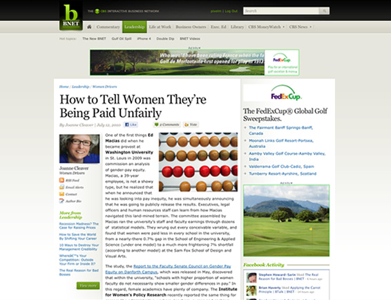
The issue: FedEx did not have any skin assets to combine with their older 728 x 90 leader board ad. We have built our new sites to be optimized for a much larger 980 x 150 leader as well as to be combined with a site skin. The 728 is from a bygone era – yet remains a staple of advertisers easily deployed assets. It is an odd size that at best feels out of place in sites optimized for the 1024 x 768 experience.
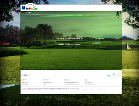
If a user were to click on any of the drivers on BNET – they are taken to a micro site with the full details of the FedEx Cup campaign. By simply grabbing the background from this site, and sizing to work as one of our Mantle-Skins – we accomplish the criteria mentioned above.
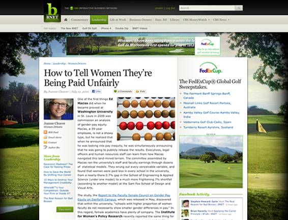
As you can see – the addition of the skin has greatly increased the presence that FedEx has on the site. However, what it has also done, is filled the odd voids on the sides of the small leader board – making what previously felt out of place feel integrated into the larger group. Odd as it may seem, the addition of bigger creative, has removed the scattered nature of these odd sized elements. This leaves the page feeling cleaner with more logical groupings to both the editorial & the sponsorship.
On the surface, one could argue that FedEx was a perfect example that only worked because they had an existing skin at the destination site. However, the same situation can be repeated even when there is no existing assets available to us. In fact, it is easier to integrate .
Example: Charles Schwab
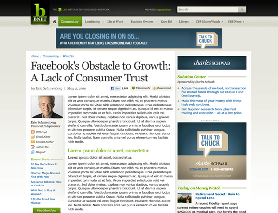
Seen above is an identical “Vendor Solution Center” built for Charles Schwab. Like the FedEx example – it too only has an odd sized 728 x 90 leader board. In this case, we create what we call a “simple skin” which samples colors from either the brand color palette – or colors being used within the existing creative. By using this as a backdrop to the other elements – all the previously odd sized pieces are consolidated into the far stronger unified block with the same effects mentioned above.
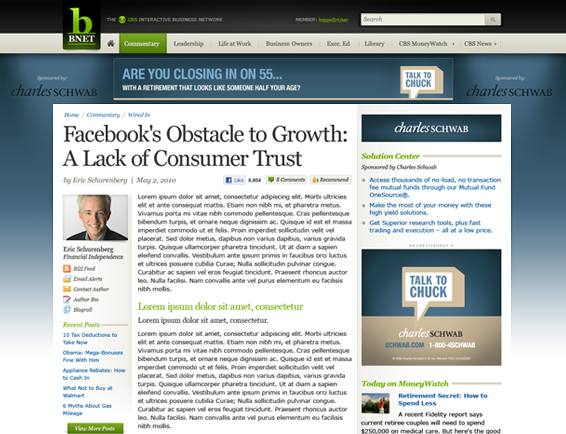
In this case, we also added a brand sconce – which places the sponsor’s logo to the sides of the leader with some minor lighting effects for some added depth. Typically we will create 2 versions, one with and another without the addition of the branding. However, we feel that either will work and only provide the two as it seems easier to gain client approval when picking between options.
The summary: These are really easy fixes that require minimal time impacts on even a small creative team – yet the up side to our products and value to our advertisers is significant. I am as eager as all other folks, in wanting to serve newer and better creative on our brands – but am aware that this will not happen overnight. In the meantime, these tricks can turn lemons into lemonade improving our products and making CBSi a “must buy” with our advertisers.
 I am an avid student and evangelist of user-centered design principles - I have created or overhauled some of the world's largest online Business & Technology properties. My focus has always been on building functional design systems that creatively solve business problems. Solutions that convey brand & messaging, but more importantly, are intuitive to maximize the possibilities of an interactive medium.