
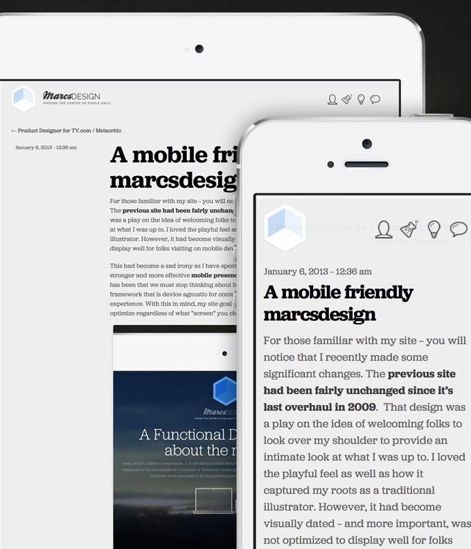
For those familiar with my site – you will notice that I recently made some significant changes. The previous site had been fairly unchanged since it’s last overhaul in 2009. That design was a play on the idea of welcoming folks to look over my shoulder to provide an intimate look at what I was up to. I loved the playful feel as well as how it captured my roots as a traditional illustrator. However, it had become visually dated – and more important, was not optimized to display well for folks visiting on mobile devices.
This had become a sad irony as I have spent the past two years advocating then building out a stronger and more effective mobile presence for properties within CBS Interactive. My belief has been that we must stop thinking about building websites – OR – apps – but create a product framework that is device agnostic for content, while being device or platform aware for the user experience. With this in mind, my site goal was to simplify, amplify content over style and optimize regardless of what “screen” you chose to visit with.

The Dyslexic Doodler
My bio as a “dyslexic doodler” is not actually a play on words… I am in fact quite dyslexic and my code has been historically filled with its share of duct tape and string holding it together. My personal site serves many purposes, but at its core remains a sandbox to try new things. Forcing myself to create only what I can code myself demands that I continue to grow, learn and “TRY” to stay as up to date on what my development teams build out in a more comprehensive way at work.
A giant step towards simplifying this effort, was the early decision to use Skeleton as my base framework. As described: A Beautiful Boilerplate for Responsive, Mobile-Friendly Development. Skeleton is lightweight and super easy to build with particularly because of the simplicity and logical nature of it’s syntax. (naming conventions)

Content over style
The idea of amplifying the content over the style, is not to suggest that I am not focused on visuals. My previous design was quite dark with the intent that it created strong contrast which allows the designs to stand out. But in reality my site is not simply a showcase of work, but a place where I offer my perspective (at times long form) on what I do, what I am working on or how and who I am learning from. So with this in mind, lightening the overall footprint serves to bring better readability to the written aspects of what I share. This along with the greatly improved accessibility given the mobile optimization are the core of how I hope to fulfill a desire to keep content over style.
Its never a wrap
For me the process remains more exciting then the destination and particularly with interactive design, there are no solid goal lines. Each new update simply brings a new foundation to build from. I am pleased to have advanced my site forward a bit and yet even more excited about where I can tweak my sandbox from here!
 I am an avid student and evangelist of user-centered design principles - I have created or overhauled some of the world's largest online Business & Technology properties. My focus has always been on building functional design systems that creatively solve business problems. Solutions that convey brand & messaging, but more importantly, are intuitive to maximize the possibilities of an interactive medium.