Last week we launched the CNET iPad App to the Apple App store and we feel strongly that it is the most elegant, simple and intuitive way to consume CNET content yet. This was one of the first projects we embarked upon as I took over the reigns of CNET design.
While we worked on this in tandem to the overall CNET redesign, we had the ability to build from scratch rather then to retrofit the extensive product and publishing infrastructure utilized for the web based version of CNET. This wide open playing field really opened up the possibilities to rethink many of our existing consumption paradigms.
Our goal was simple:
We wanted to greatly simplify the exploration and consumption process. This applied to both what is new and published by our editorial team, as well as access to topics and sections sought after by our users. To do this, we insisted on making it feel very iOS specific to take advantage of how users have already learned to interacted with Apple’s tablet device.
What we came up with is a multi panel display that separates browsing from consumptions into 2 simple but distinct views – a list or browse view and a consumption panel.
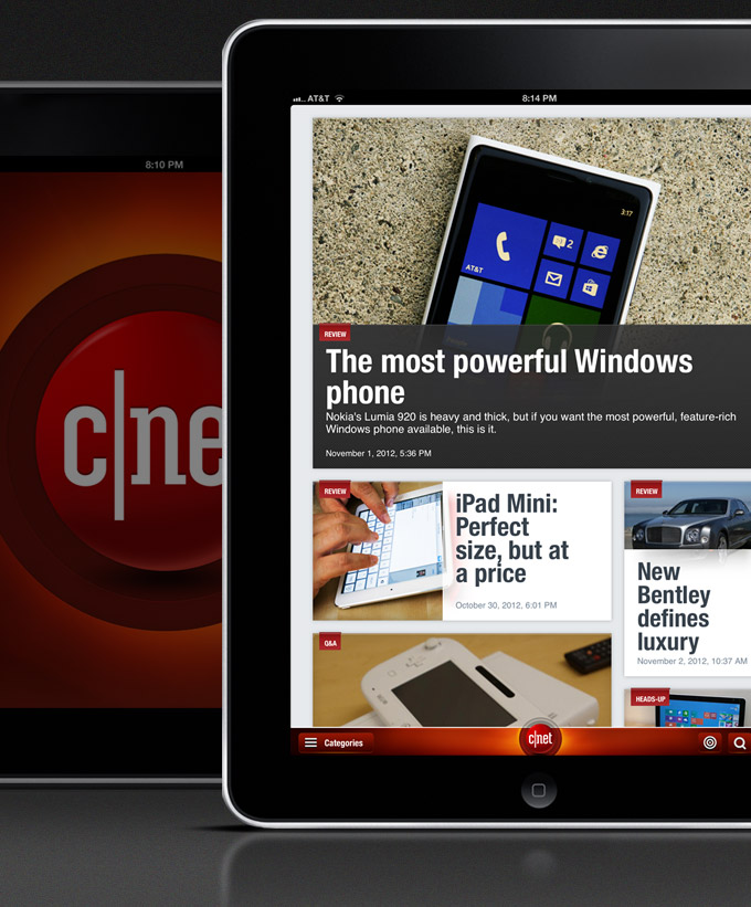
The experience begins with a list view or river of stories that leads with larger and more prominent features up top. While the grid itself can be controlled by editorial teams based on the importance of a single or multiple stories – the recent or most important content sits in various larger tiles that form a brick pattern up top.
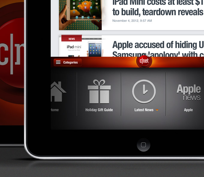
From the lower left of any view, a user can open a section drawer that exposes the numerous ways they can aggregate the list view of content based on a given category, topic or type of CNET special programming such as our Holiday Gift guide or our future CES programming.
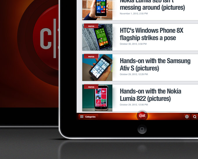
As you scroll down through the experience the masonry pattern from above gives way to a simplified list view. The story headline, image, content label and date stamp remain, but are sized down into a streamlined stack for more uniform browsing.
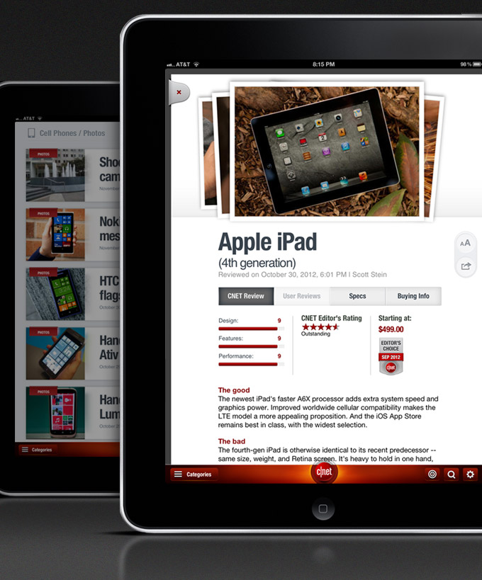
Once a user clicks on a headline, a consumption panel enters from the bottom with the given story. This is the same for all content, however each has elements that allow a user to simply consume, paginate or do a deeper dive. This is the case in the review above where users can tab this view to deep dive into the content subset of the full review, user review, product specs or where to buy.
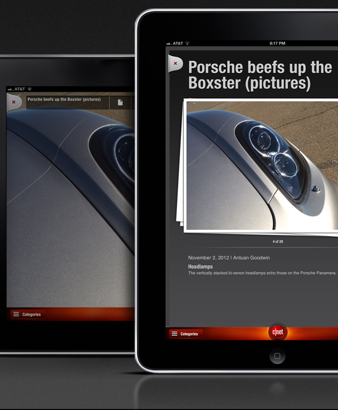
In the case of an image gallery, we reverse out the experience to provide a theater view. This helps to highlight the featured image as well as the related thumbs to stand out by utilizing higher contrast for this view.
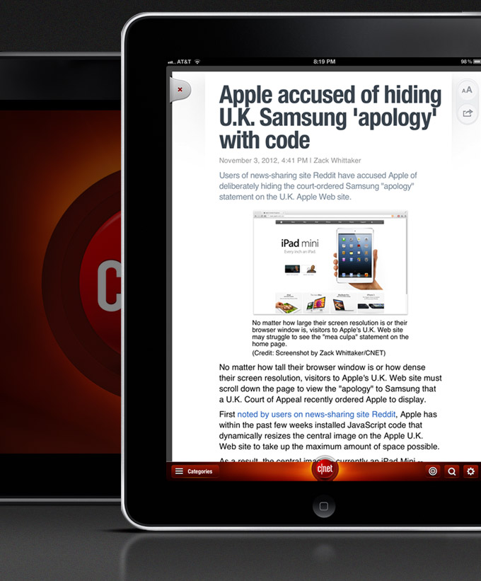
Similar to reviews, news articles open into a single story panel that users can scroll vertically for the full read or to view any related in line content information or author bios that cap each piece of content. From any piece of content, users can either close each individual panel or simply swipe left and right to access the next & previous story.

On the right side of the display (directly where the thumb sits) lives a consumption utility that is accessed by tapping the right side of any article. From here users can size up the content for increased font readability. Or a user can tap the share function to access means to pass enjoyed content along to folks in their social graph or by email. As we add more consumption utilities, this feature will likely change or be built upon.
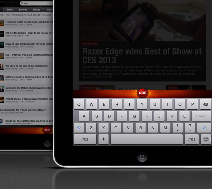
From the lower right of the tool bar, a user can both alter their settings or search the app with the simple magnify icon. Similar to the topical drawer, the keyboard panel also emerges from the bottom of the display / product experience. Search results display just as they do when making a query on the native device. Once in a story from a result, users can swipe left and right to paginate to next and previous items with in the list.
So there you have it – The richness of CNET’s content in a simpliefied native tablet app to enjoy. This is obviously our v1 release and we will only build on this from here – but given that we consume as well as produce CNET, we are really excited about this new method of getting all of what CNET has to offer in this streamlined form factor. Give it a try and let us know what you think! We really are listening and want your input to make it the best experience possible~

 I am an avid student and evangelist of user-centered design principles - I have created or overhauled some of the world's largest online Business & Technology properties. My focus has always been on building functional design systems that creatively solve business problems. Solutions that convey brand & messaging, but more importantly, are intuitive to maximize the possibilities of an interactive medium.