
A look forward:Â With any interactive product, a lengthy history can be both a blessing and a curse. The blessing is the vast brand awareness along with a mature and stable product and business that can deliver the brand promise at scale. This is an enormous advantage. However, this maturity can also create fragmentation as products evolve over the years and introduce adaptations to the many legacy elements. The liability of this will affect the pace of future innovations. As a result, larger infrastructure efforts can go a long way toward leveraging the pros while minimizing the cons.
Over the past year, that is precisely what we have been up to with CNET. There has been a tremendous effort behind the scenes to streamline our many back-end platforms. The result will provide major updates to our CMS, as well as our SEO and Catalog systems. The product design team has constructed an overhaul to the front end that employs an even more modular and component-based design framework. Our goal with the design was not to treat this opportunity as a holistic rethink of the product, but to redesign with 3 core success metrics in mind:Â Lighten, Widen and Simplify. Combined with the streamlined publishing platform, this will allow us to become vastly more nimble in how we expand the user experiences over the coming months and years.
Lighten
Lighten is not to suggest a bleached or vague color palette, but more that we have gone to great lengths to reduce the amount of noise and clutter across the presentation layer. Our colors remain strong and bright, but the design works hard to get out of the way, giving more prominence to the beauty of the content experience. We have removed many of the ornate gradients, shadows and subtle tonal transitions in favor of a simplified yet bold set of visuals for branded components and navigational paradigms.
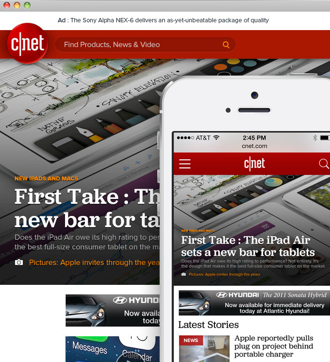
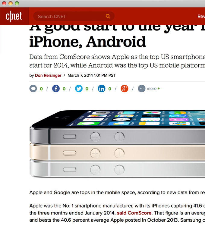
Over the past few years, we have dramatically changed our style of photography. We have gone from a catalog style to one that is more organic and photo essay themed. There was a time when CNET introduced users to the technologies that would “become” a part of our digital lifestyle. However, these days technology is all around us. As a result, the new design allows for larger visuals as a critical component to the stories we tell, one intent on creating a feel that both illustrates the inherent beauty of the gadgets we review and assists the narrative quality of our news coverage.
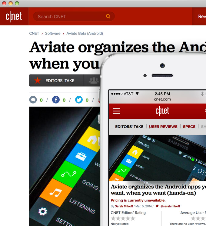
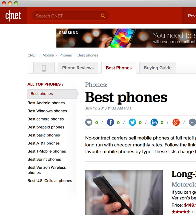
Our product reviews continue to live as a complete ecosystem of product discovery, one that allow users to easily read or watch what CNET editors think and what their peers think, provides access the manufacturer specs, and tells you what you’ll expect to pay and where you can purchase. Each review is anchored with our signature Good, Bad, Bottom Line up top. The review that follows walks through the full product rundown, including technical specs along with photography that illustrates the tech in real-world environments.
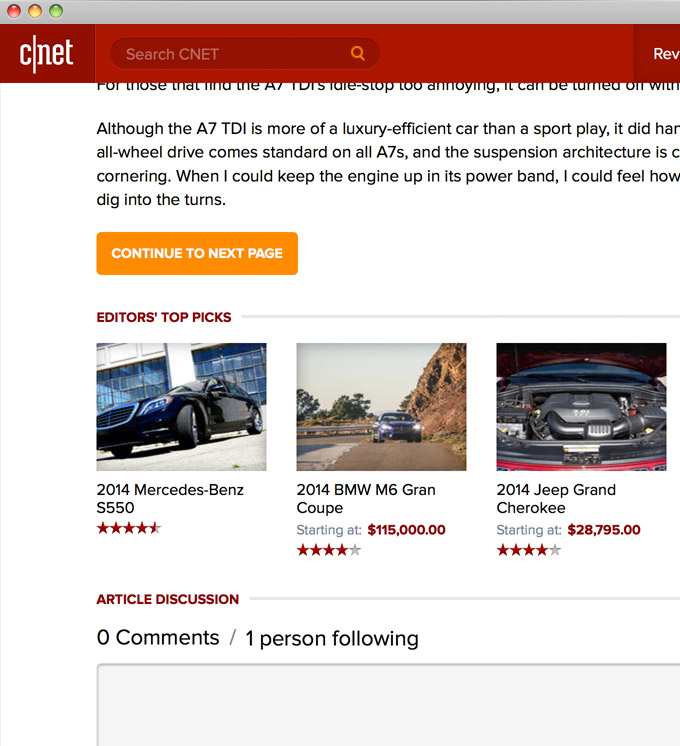
Our product categories are also grouped as a comprehensive ecosystem to help users quickly find product information at either a macro or micro view. Users can easily jump from a variety of connected experiences to define specific brand or product criteria, browse the latest or check out our curated “Best” lists that showcase the top products based on the most common use cases.
Widen
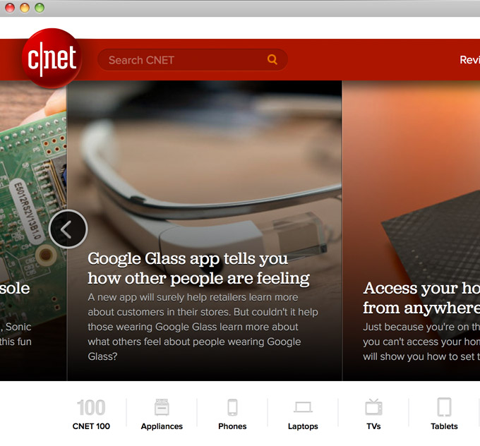
At a glance you will notice that the experience is in fact a fair bit wider within the browser experience. Larger screens and high-density displays leave the previous footprint feeling small and fairly underwhelming. We take the approach that “Everything is mobile.†Mobile uniquely must deal with orientation, landscape vs. portrait, thus even within an adaptive framework the experience must employ a responsive component. With our early efforts in mobile our desire was to ensure that the experience would be device agnostic for content, while being device or platform aware for the user experience. With our latest update, we believe that the viewable dimensions should also respond to what is available in the desktop experience as well.
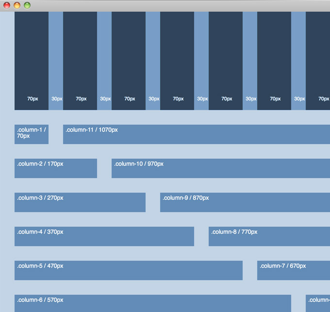
To achieve this, we simply apply the same techniques typically thought of in terms of sizing the experience down to also size things up. To do this, we have simply modified our version of the very standard 960 GS to include a trip point between 980 and 1,230px. We maintain a 12-column grid structure, but proportionately jump between 12 units of 60px spaced by 20px gutters to 12 units of 70px spaced by 30px. The end result delivers two desktop widths that jump between a total width of 980px and 1,230px.
Simplify
Any redesign hopes to simplify the overall experience in an effort to bring more focus to the core aspects of what serves and to wow users. Much of what was done to lighten the experience attempts to serve this goal by ensuring that the content and the narrative take center stage over the form. However, we have crafted simple utilities that streamline navigational paths to ensure direct access to what matters most. As you scroll down, the branding collapses to allow a minimized header to anchor the page.
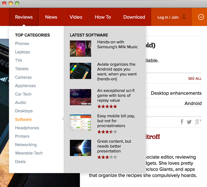
This allows for direct paths to be within reach from any point in the experience. Core functions are moved to the corners. Search anchors the upper left and folks can browse the latest from each section or jump directly to a specific product, news, or how to category / video series on the right.
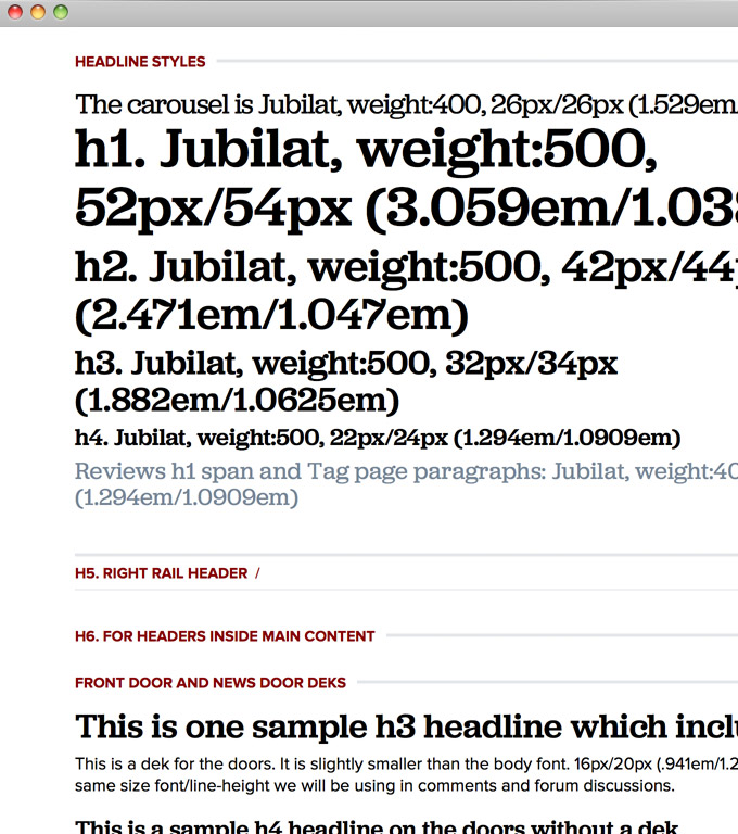
To complement the lighter visual footprint, we are using bolder typography as a means to deliver more hierarchy to the content mix. We searched long and hard for fonts that are readable and complement the nature of our content and brand. We opted to use Proxima Nova for body and list fonts specifically for its very readable characteristics and deep family of weights. Its simplicity gets out of the way to deliver readable yet contemporary style while not placing form over function. Its many weights pave the way to illustrate various meta elements and navigational paradigms. While we did not want the read aspect to overwhelm, we did want an accent font to anchor content and sections. We found Jubilat with its gentle curves but hearty slabs to deliver a much-desired personality that compliments the prime typographical elements of the CNET branding.
While we do apply some grayed-out treatments, much of the typography relies on solid blacks to insure a bold contrast to the open white background and ensure the best, most readable experience.
A new foundation and a nimble tool set
It is amazing to work on a project like this with such a passionate, dedicated and inspired team. There are countless folks across many time zones in product, editorial, engineering and of course design who poured their hearts into this effort. While there are far more details to list, we are most excited by what can come next. With such a hefty effort going into the mechanics under the hood, we are thrilled to finally share the new experience with our audience. However, the updated platform will most certainly help us jumpstart the pace of future innovations, some of which are right around the corner!
 I am an avid student and evangelist of user-centered design principles - I have created or overhauled some of the world's largest online Business & Technology properties. My focus has always been on building functional design systems that creatively solve business problems. Solutions that convey brand & messaging, but more importantly, are intuitive to maximize the possibilities of an interactive medium.