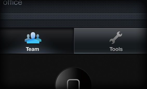
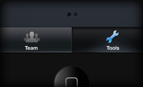
The use of common navigational GUIs are key in showing users how to quickly learn your App. Apple’s iPhone SDK and visual language are very well defined which makes it that much easier to create effective navigation / user flows.
Given this, I typically use a standard base level tab style. However, a recent project prompted me to challenge my own best practice. The product called for a 2 tab experience, however the standard style looks underwhelming and awkward when limited to only 2 choices. The goal was to play up the product’s simplicity – but the spacial relationships delivered the opposite effect.

The Solution
I created a customized tab style that is visually tied to the standard SDK – yet one that utilizes the full width of the bar. This is where the standard SDK implementation fell short. However, when occupying the entire space, it plays up the simplicity of the navigation with a strong presence rather then to feel overly simplified due to an awkward spacial relationship.


 I am an avid student and evangelist of user-centered design principles - I have created or overhauled some of the world's largest online Business & Technology properties. My focus has always been on building functional design systems that creatively solve business problems. Solutions that convey brand & messaging, but more importantly, are intuitive to maximize the possibilities of an interactive medium.