
A look backward: In June of 2011, I took on a new challenge at CBSi at the helm of the CNET design group. One of the key requests made by new CBSi boss Jim Lanzone was to bring a renewed heat, vitality and energy to the brand. Users needed to immediately “know and recognize” that they were at CNET.
![]()
Since that time, we have made a number of changes in an effort to make the site both more contemporary as well as to improve its usability. However, on the cusp of more updates in the brand’s future, the change I remain most proud of is the decision to return to the brand’s signature roots within the logo itself.
![]()
The original logo seen above, with its quirky slab serif font and pipe that separates the C and the NET, had been a staple of the web 1.0 landscape. Combined with the vibrant yellow and green color scheme of long ago, there was never a question for users: they knew they were on CNET.
![]()
As we began early design explorations for a revamped CNET, we spent a fair bit of time looking at the brand’s history. This included time viewing old site comps as well as pages on the Way Back Web Archive to understand how it had evolved over its long history (long in terms of digital brands online). This walk down memory lane revealed a brand that had been historically drenched with personality.
![]()
Fast forward to 2008: CNETÂ launched an updated design that eliminated much of what had until then been signature components of the brand’s presentation, including its recognizable logo. Many of the users complained at the time that the new branding felt generic and lacked the character of CNET’s memorable past. From the outside, my take at the time was that it attempted to tie the branding specifically to a transitional web 2.0 aesthetic that was seen as contemporary during this time. It simplified the font treatment and amplified the presence of the ball by making it an actual sphere rather than the disc-like shape of its past.
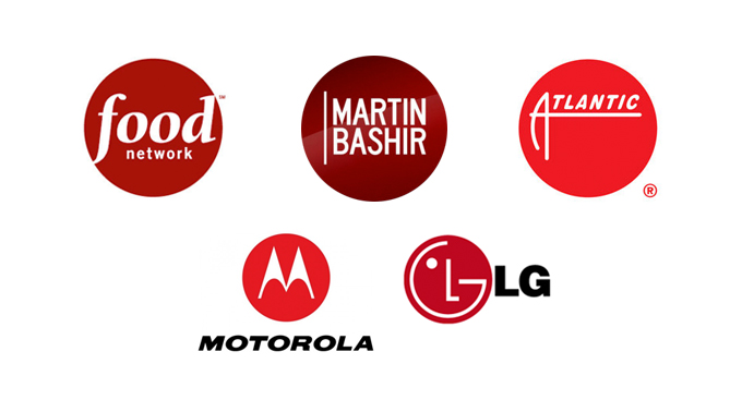
There are countless examples of brands that have relied on a simple font treatment on a red ball. (Motorola, Atlantic records, Food Network, LG, and news broadcaster Martin Bashir just to name a few) However, elements of a brand must have meaning beyond what is considered momentarily current. The symbol must convey meaning beyond the ever-changing transitions of design currency.
While internally some folks had begun to actually refer to CNET as “Redball,” the historic elements of the brand did not seem to really be about the ball, but a badge. At the heart of this badge was the quirkiness of the typography along with the piped partition between the C and the NET. It was never about a ball, but about a stamp or symbol that represented the prism and perspective by which we reviewed cool new products or in how we cover the many news beats for consumer technology enthusiasts. With so much brand history in what remains a relatively new digital medium, creating yet another new logo would only seem to take us further from what makes us unique and recognizable in the larger history of digital brands on the web.
![]()
As we explored options to infuse recognition into the experience, we could not escape the importance of playing up the very history of the brand. With this in mind, it felt obvious to return to the quirky and narrow slab serif font along with the pipe partition. Next was to amplify the size and presence of the typography in regard to how it sat within the badge itself. Last was to alter the lighting so that we could tone down the dimensions that made it appear as a ball, while playing up the depth of shape so that the mark could take on the characteristics of a disc-like badge.
![]()
These renewed branding elements have once again become a staple of our visual language and the cornerstone to all we have done since. It anchors all of our web and mobile experiences and carries the weight of our brand presence as it extends to the many places it may be found. Most important, however, is how it infuses the colorful history that is immediately recognizable. In an industry and medium where so many have arrived only to disappear, the CNET branding remains a badge that maintains its meaning.
 I am an avid student and evangelist of user-centered design principles - I have created or overhauled some of the world's largest online Business & Technology properties. My focus has always been on building functional design systems that creatively solve business problems. Solutions that convey brand & messaging, but more importantly, are intuitive to maximize the possibilities of an interactive medium.