It was an exciting week for us to be able to launch our newly completed iPhone and Android apps into the the marketplace. While this first release is not as feature rich as I would like them to be, I feel good about being able to create an app framework for both platforms that we will be able to build upon in the coming months.

Knowing that the first release would be light on function, I tried to insure that the design would be visually simple but in context to what a user would expect on either platform. While the product is basically a reader app, CBS MoneyWatch has some additional nifty market data and stock look up functions that you would expect with a personal finance brand.
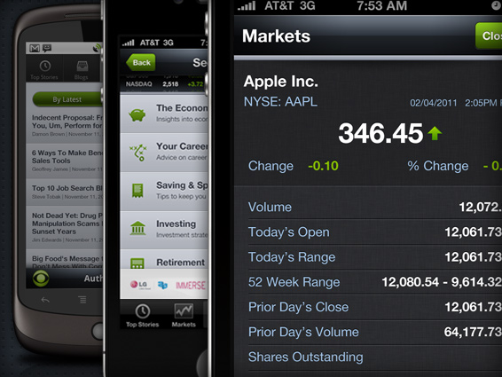
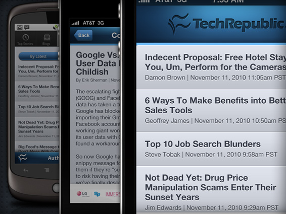
The bones of all 5 apps share the same tab based organization structure. Each is then given a skin adopting the characteristics specific to each brand. The business & Finance products organize their content with the same topical sections users are familiar with on the desktop site – or by a specific blog.
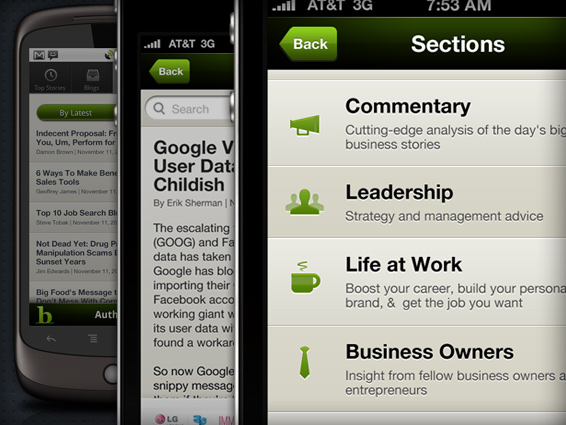
The Tech News products on the other hand are organized either by the specific blog, author or by popularity. However, at the blog level all of the apps offers the ability to filter by the latest content or popularity.
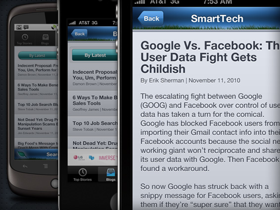
As users arrive at the article level, a simple but nice function is the ability to swipe left and right as a means to paginate through stories rather then having to click back to the previous list view.
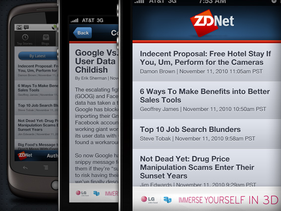
Each app is currently monetized with a standard 320px leader fixed to the base. However, on the article page, the otherwise ubiquitous tab navigation goes away to allow more space for content. Search is also available from any page by simply swiping down to access a search text input.
While we are eager to make improvements and add such features as video, community and member profiles – we become that much closer by launching a base platform that we will surely build upon in the coming months ~

 I am an avid student and evangelist of user-centered design principles - I have created or overhauled some of the world's largest online Business & Technology properties. My focus has always been on building functional design systems that creatively solve business problems. Solutions that convey brand & messaging, but more importantly, are intuitive to maximize the possibilities of an interactive medium.