
The adoption of smart phones has been enormous (iPhone, Android, etc). With this, has come literally hundreds of thousands of applications – each that does any number of things from consumption, functional utility to entertainment. However, what would seem most consistent with the best of these Apps, is the simplicity and focus that is brought to a finite feature set. For those developing apps, the canvas to create offers a far smaller palette (320 x 480px) However, I would suggest that while this may have begun as a limitation, it has driven serious innovation by forcing folks to be more disciplined in choosing what elements truly respond to the user’s intent. This forces efficiencies to only solve the tasks at hand, applying the most simple and easy paths to any desired function set or consumption model.
The details of how this is achieved could become many posts – However, my hope with this article, is to provide a case study on how this streamlined focus has been applied in a desktop or browser based interactive experience. Most folks have found themselves on a site where it is difficult to determine the flow of content – or often what to do next after having read something on a typical media site. These sites go to great lengths to be everything to every possible use case. In addition, they have also bombarded pages full of what they believe will make their pages appeal to the search engines as well as the user.
The result: Pages with countless items of varying use, stacked beside or on top of one another – all screaming for the users attention. The problem is, when everything is important and screaming – nothing wins. Sites go through numerous redesign in an effort to clean things up, but seldom do folks really apply the serious discipline to focus only on what is needed – thus, many redesigns are a case of sweeping a mess from one side to another, or under the proverbial interactive rug!
Case Study: The New msnbc.com – specifically it’s Article page
Most folks who know me, have heard me reference the Product or Design done by the folks at msnbc.com. Their last major redesign from over 4 years ago, proved to be ahead of the curve for many things – It greatly simplified their section door river feeds, as well how they present and monetize video content.
That said, I find many elements of their latest design to be in flux – caught between where they were, and where they perhaps want to go. However, the Article page has taken a distinctive new turn – One that is attempting to really adopt some core elements of an “Application focus” to it’s user. The page itself displays quite different from a typical article page – in some instances, the execution fall’s short. However, the ideas built into this are uniquely new… they will be fine tuned… and I suspect that over time, both user’s and the search engines will really dig this.

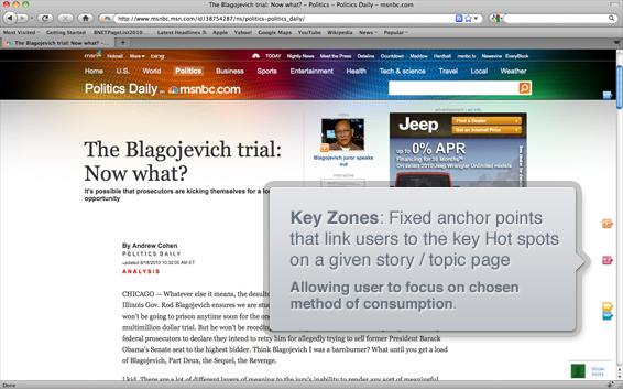
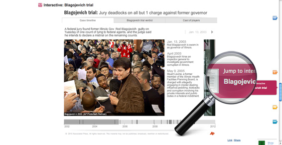
The icons above represent the “Key Zones” that msnbc believes will respond to a user’s intent – To me, this is both the most important and radically new design element – as well as the one where the execution falls sadly short. Currently, I see these as too small, thus their importance is not fully or quickly realized. This as an easy fix – I would size & treat them more consistent with the icons you see on the welcome screen of a typical smart phone.
Which brings me to why I think these are so critical. They serve to illustrate what options a user has with any given piece of content. The corresponding icons only exist when the particular consumption layer exists within a given story / topic. That said, this also assumes that the users intent is to either, Explore, Read, Interact, View, Watch or Discuss. The icons function as fixed anchor points attached to the right side of all articles that link users to the important “Zones” needed to tell a specific story, or elaborate deeper into a given topic. The page has then been broken up into series of stacks that focus on that particular layer’s intent – Often, it then provides a deeper level of function within. Rather then force a user to link out to different pages – everything that has to do with their stories can be accessed from this constant point of entry.
The screens below illustrate the various consumption options that I found by visiting the key zones with in the single article: The Blagojevich Trial: Now What
Example: Read the Story…
The page on arrival has been ultra simplified. The headline element uses a super-sized font, as well as seemingly print style use of negative space around it. I have heard many folks comment that it is a great waste of space. However, it is quite clear where you are – both on the grand scheme as well as relative.
Example: Watch a video Segment…
A simple clutter free display – however, users can consume in a variety of ways. Simply watch the embedded segment or…
- Access more on the Specific topic via the play list to the right of the video
- Access more from the “Today Show” series or a parent level topic via a tabbed drawer below
- Access a full text transcript of the show via a tabbed drawer below

Example: Dive deeper to watch more from a given topic
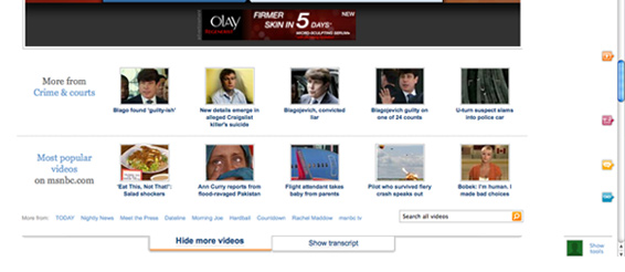
As suggested above – below illustrates the simplicity of how you dig beyond the Blagojevich trial. By clicking “show more” – the drawer opens to expose more segments in the parent category of Crime & Courts. Also available is short list of the Most popular segments – An even more general way to find other pieces that may be of interest. What is key, is with it’s direct focus on Video as a consumption choice, it allows the design to build in multiple layers to be accessed from a finite choice of options.
Example: Walk through an interactive time line of events or info graphics
This can be as simple as an inline gallery of large photographs – or a tabbed body of various image based storytelling. Each serve to bring you closer to the story / topic of interest.
- A chronological photo essay
- A local news video of Blagojevich’s reaction to the verdict
- A Cast of important characters, with photo reference & bio to each
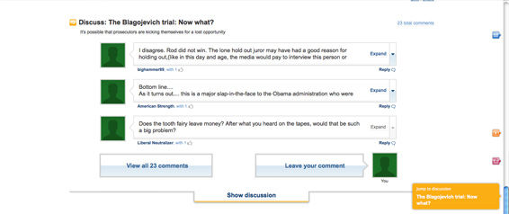
Example: Discuss with others – or simply read what others had to say
A simple display allows a user to scan a short list of the type of responses the story has seen. From here you can drill deeper into a specific comment, see the list of all, or voice your own thoughts to the story in general or as a reply to a specific comment. Nothing here is revolutionary – but it follows the consistent theme of multiple layers accessed via direct paths.
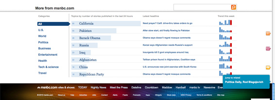
Example: Explore more on msnbc
A new and interesting data visualization that provides a dense dashboard of possible links. By mousing over any of the far left base level categories, the users see’s a list of topics based on the total number of stories published in the past 24 hours. Then each topic is distilled down further to reveal the latest headline per topic with a corresponding bar chart to illustrate how it has trended throughout the past week.
This not only houses a great deal of content, but it also serves to allow users to visually see the high level topics as well as key stories in each section providing a quick overview, or “getting caught up at a glance”.
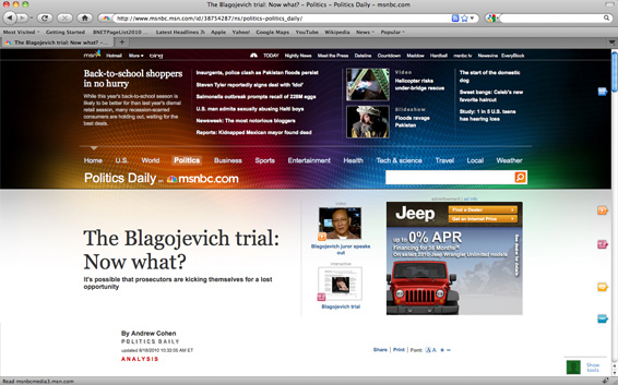
An interesting Easter egg: The homepage in every page
On load, each article displays the standard masthead. However this is done by loading the page at a fixed vertical point lower on the page. Thus in addition to scrolling down, you can also scroll up. This can be a wonderful surprise to find having scrolled back up the page to reveal more key stories or to dive deeper into the main sections of the site.
Further, when a user mouses over any of the same base level categories – this reveals a deep dashboard for all sections, consisting of a lead item, list of top stories, 2 multimedia options & more topics on msn. This is in essence, the entire front door of the site accessed from any page in the user experience. Thus, in addition to the wealth of information already found on the specific story / topic – a user can also go from a narrow focus to a broad based one. These pages not only provide focus to the user – but also to the search crawlers.
For many, the verdict seems still out on whether they like this new design or not. My personal reaction is mixed on a number of points. However, most have to do with the specifics of how details have been executed – ALL solvable things.
What I really admire, and bow my head to – is the fundamental shift in approach. These pages at face value do not try to be everything to everyone. However, it’s effort to zone the page based on core areas of user intent, reveals a more focused, far richer & more enjoyable experience One that empowers the user to access what they need, based on how they want to consume it.
 I am an avid student and evangelist of user-centered design principles - I have created or overhauled some of the world's largest online Business & Technology properties. My focus has always been on building functional design systems that creatively solve business problems. Solutions that convey brand & messaging, but more importantly, are intuitive to maximize the possibilities of an interactive medium.