
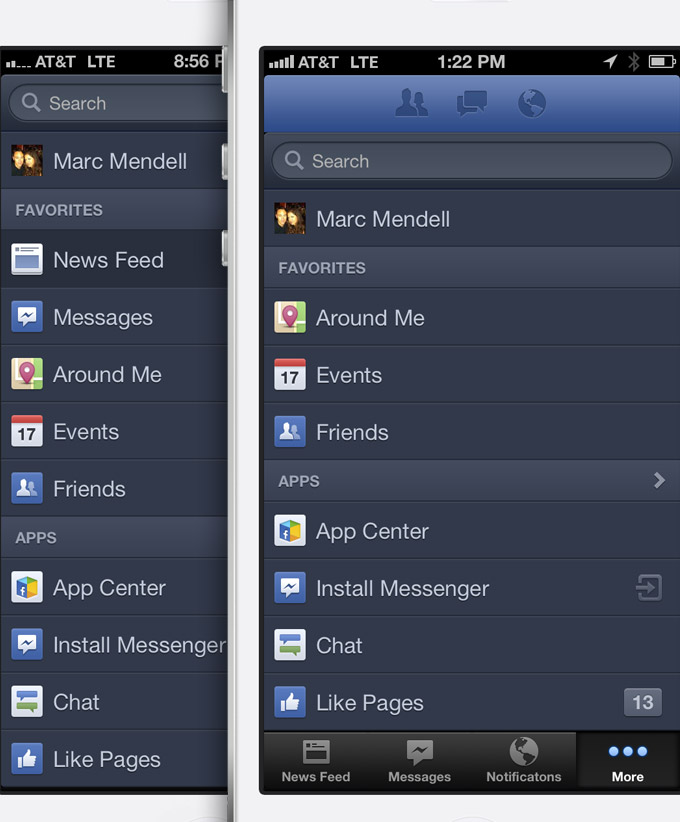
Recently I have been experiencing some odd quirks on my Facebook app for iPhone. Initially, I had thought that the app had simply been updated with a change to it’s primary navigation moving from a side drawer system to a bar at bottom of the app. Below you can see the new experience. However, as I asked friends and coworkers what they thought – none seemed to have this change reflected in their application experience.

They all still had a drawer system accessed from the masthead which exposes a lengthy linear list in the side drawer. What was equally odd, was that this change did not occur as a result of an update from the app store. At the time, I had been eagerly watching the updates on both the website and native app experience out of curiosity about the recently promoted changes to the “News Feed”.

As I played with the updated version, I immediately had issues with it. The bottom navigation feels like a dated paradigm, and functionally it cuts into the valuable vertical real estate that I have to consume the contents of my feed. Over the past months the app has evolved to include larger images, both vertical and horizontal (something that I like) as well to include recommendations (ads) in to the experience. All of which make greater demands on the mentioned vertical space.
As you can see below, the side drawer with it’s separate vertical scroll supports the deep navigational options that the app supports. Since the “filter” panel is only exposed on engagement, the consume layer is able to maximize the viewable space within the experience. (Also something that I like)

I felt that the app was both looking really sharp as well as serving to provide easy access to the growing depth of filters and utility that the product has to offer. Not only that, but it was pretty darn fast.
Now fast forward back to the update. As I mentioned, the minimized vertical consume layer seem to make my iPhone 5 have as much viewable space as my iPhone 4 with it’s smaller screen. Grrrrrr… As I played with it more – the contents of the top and bottom nav options are duplicated which undermine any justification for giving up on my consume space. An inventory of the top offers access to my friend request, my messages, my notifications as well as a secondary method of starting new messages via the drawer system on the right. The lower navigation offers me nothing new, except the more tab which exposes the contents that were previously accessed via the control in the upper left of the masthead.

Below you can see the main change to the side drawer contents. On the left is how it was when accessed via the masthead. The core of the app seems accessible, logically grouped and catered to the main areas of “intent” for the experience. To the right is the new experience with it’s smaller footprint sandwiched between the functions nearly mirrored top and bottom. The main difference: The more button on the right opens the menu. The news feed button on the left – OR – a selected item from the list, will close it.
My take away: A confusing twist to the primary navigation that gave me no benefit and takes away from the enjoyment of the feed itself.
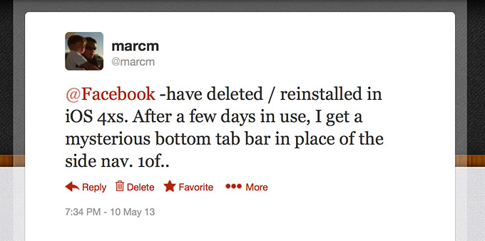
This brings me to the part about it being quirky. By quirky I am not referring to the change itself. That I simply don’t like. However, none of my friends and coworkers seem to have this new experience. So out of curiosity, I deleted the app and downloaded it again. To my delight, the fresh download gave me the previous experience which I like very much.
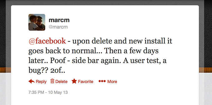
However, as I use the app for a short bit – it seems to magically morph back to the lower tabs from the side drawer on its own. (Not after further updates)Â First I thought, perhaps I am getting senile and just performing batch updates as I get notifications. However, I have now deleted the app and retrieved a new install 4 times. Each time I am greeted by the version I like followed by the transition back into these tabs!
This experience has spanned a few weeks. During that time, I have broadcast on twitter a number of times to see if any others are experiencing anything similar. Thus far, none of my extended network have been able to confirm anything similar. One suggestion was that perhaps I was stuck in an A/B user test. We do these on my teams all the time and it makes perfect sense.
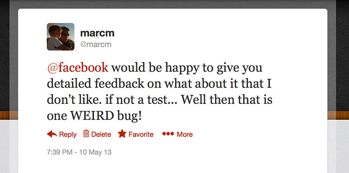
So tonight I broadcast my issues yet again. On previous tweets, I had included screen captures of the experience in the hope that someone in my network could chime in to say that they also had the same experience.
My hope was also to understand weather or not I am in fact in a user test… as well as why I can not seem to get out of it when I delete the app and re install a fresh version. It has been interesting to see what I am guessing is product experimentation from Facebook.
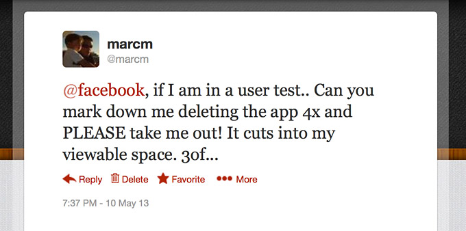
However, after playing with it and trying to acclimate to the changes… I remain unimpressed and would simply prefer to go back to using the previous app that seemed so impressive up until the latest round of updates. With each of my comments or complaints about the new tabs (on twitter) – I have offered to provide more detailed feedback.
Over the years I have used twitter to make remarks about any number of product and customer experiences that I thought were either good, bad or could be improved upon. On many occasions I have been amazed by the unexpected and quick response I have gotten from big brick and mortar businesses, banks, retailers, local restaurants, magazines and many individuals. So somehow I thought Facebook who’s sole product mission IS social would respond with a comment, question or even explanation.
Regardless – Facebook is a product that I like… and I have a dual intent in sharing. First, I think user feedback is great and am always happy to share. Second, I would like to get out of this user test and either continuously get back to the previous version – OR – voice my thoughts to help it’s next iteration.
 I am an avid student and evangelist of user-centered design principles - I have created or overhauled some of the world's largest online Business & Technology properties. My focus has always been on building functional design systems that creatively solve business problems. Solutions that convey brand & messaging, but more importantly, are intuitive to maximize the possibilities of an interactive medium.